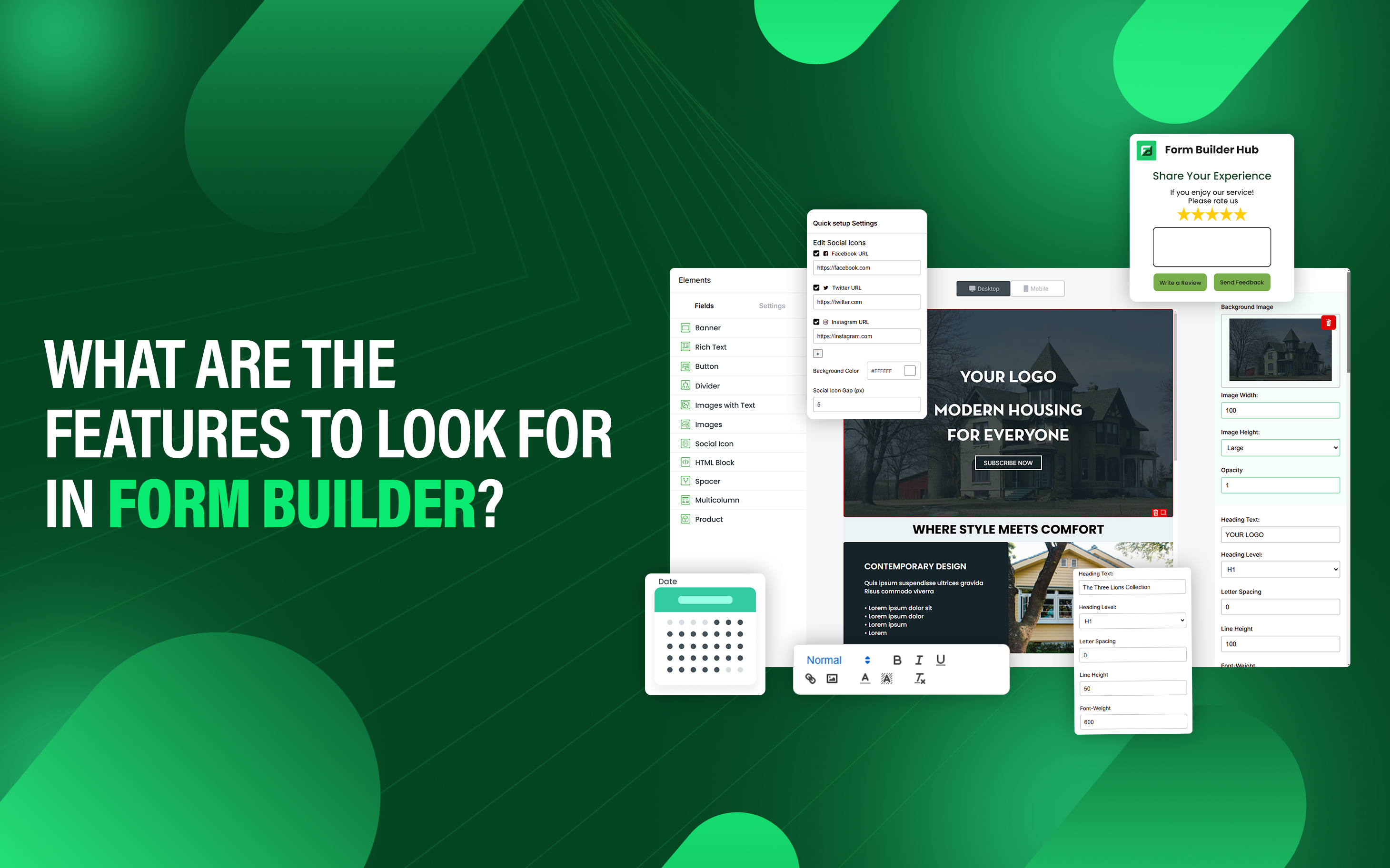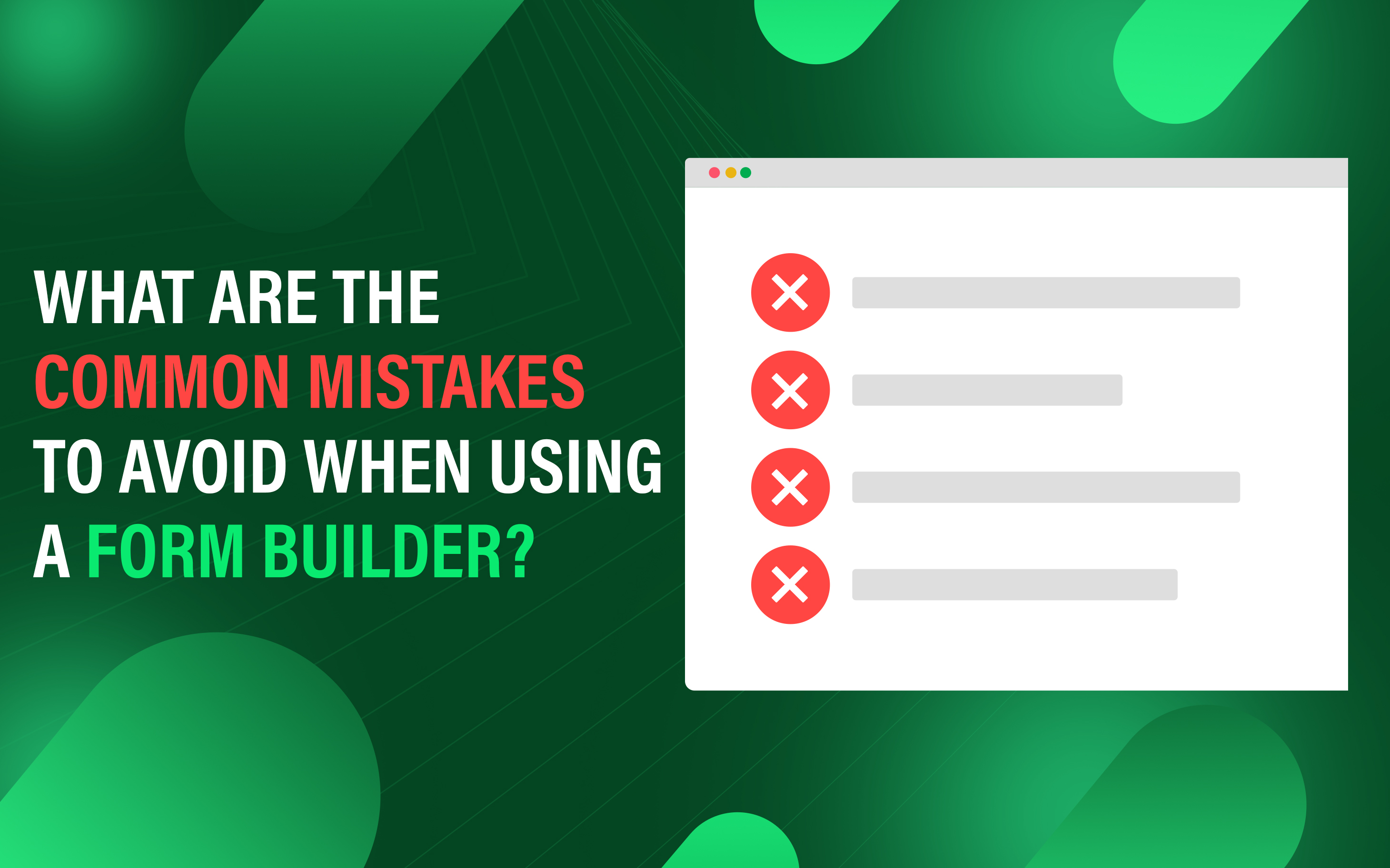


What are the Common Mistakes to Avoid When Using a Form Builder?
Form builders are powerful tools for creating forms, but their effectiveness depends on proper setup and design. Many users make mistakes that negatively impact user experience, data quality, and conversion rates.
Understanding these mistakes is crucial for optimizing form performance, improving user engagement, and ensuring accurate data collection. A well-structured form should be easy to navigate, intuitive, and aligned with its intended purpose.
By identifying and avoiding these mistakes, individuals create effective, user-friendly forms that enhance conversions and streamline workflows. This guide outlines the most common mistakes users make when using a form builder and provides insights on how to prevent them.
This article gives an overview of the most common form-building mistakes and provides insight on how to prevent them.
- Mobile Optimization
- Email Notification
- Complicated Form
- Less Instruction
- Allow Anyone to Submit the Form
- Multiple Columns
1. Mobile Optimization
/Image1.png)
Form that is not fully mobile optimized leads to poor user experience, frustration, high bounce rate, and lost conversions. With the increase in mobile usage, forms that are not optimized for different screen sizes are difficult to read, navigate, and complete. If a form is difficult to complete on mobile, users are likely to abandon it before submitting.
To avoid this issue, use responsive design that adapts to different screen sizes, follow a mobile-first design approach, and ensure touch-friendly elements with appropriate spacing. Additionally, test forms on multiple devices confirm that easy navigation, fast loading, and full functionality. Proper mobile optimization improves user experience, increases engagement, and conversion rates.
2. Email Notification
/Image2.png)
Many store owners forget to link their email with the form builder and do not get any notification. When form submissions require immediate follow-up, such as customer inquiry, order request, or survey response can lead to lost leads due to delayed response or customer dissatisfaction.
To prevent this, ensure that emails are correctly set up. Test the form for automated confirmation email to verify that store owners or customers receive alerts in real-time.
3. Complicated Form
/Image3.png)
A complex form with too many fields or unnecessary steps confuses users. Asking for too much information can make users feel like their privacy is being invaded, especially if the information requested doesn't seem relevant. Lengthy forms also take more time to complete, which is difficult to complete, particularly on mobile devices. Additionally, messy layout and confusing field labels make forms harder to navigate, further reducing usability.
To streamline the form, eliminate unnecessary fields, and use disclosure when additional information is required based on user responses. Keeping forms simple, clear, and intuitive ensures a better user experience and higher conversion rates.
4. Less Instruction
/Image4.png)
If you do not provide the clear instruction of form with too many fields, this confuses the user and increases the chance of reduced completion rates or poor user experience. Poorly designed error messages and a lack of clear instructions increase the change of errors and incorrect data entries.
Test forms before deployment help to check the broken functionality. Use simple and clear language when writing instructions. Clearly define each step and break down complex steps into bullet points or numbered lists.
5. Allow Anyone to Submit the Form
/Image5.png)
Allowing anyone to submit the form without restrictions is a common mistake when using a form builder, as it leads to spam submissions, data quality issues, and security vulnerabilities. Spammers use fake entries in form and submit, which can fill the database with junk data.
Implement proper validation, email verification, authentication, or CAPTCHA where necessary. These measures help to ensure that only genuine users submit the form while maintaining data integrity and security.
6. Multiple Columns
/Image6.png)
Too much information in parallel columns, confuse the user in reading and make it harder to complete the form. This layout frustrates users to shift their focus between columns, potentially leading to errors or missed fields.
Multiple columns may not adapt well to smaller screens, forcing users to zoom or scroll excessively. Layouts in multiple columns should be used only when necessary for related fields like "First Name" and "Last Name" rather than complex sections, and ensure proper mobile optimization across various devices and screen sizes.